Hollywood Hills / Los Angeles, California

Front Entrance
Overview
Welcome to the home of Anthony and Apollo. Names have been altered to protect the innocent.
A 1925 Spanish home in the Hollywood Hills, reimagined as a living Colour Portrait—one that reflects love, temperament, and belonging.
Temperament lives in our DNA.
It reveals how much colour, light, sound, and touch we need to feel at ease.
Through our interactive Colour Play™ process, Anthony and Apollo discovered the colours that spoke to their personalities, souls, and desires.
From this exploration emerged their individual Primal Colour Palettes—unique, instinctive, and deeply personal.
Colour: The Ultimate Influencer
Establishing Emotional Harmony Between Colour and Architecture
Creating Meaningful & Sustainable Environments
Integrating Client Insight Prior to the Design Process
The result is a home that reflects who they are—and how they wish to feel within it.
Anthony’s palette called for softer, cooler hues to create inner balance.
Apollo’s palette required stronger colours and higher contrast—his version of ease and equilibrium.
The journey begins at the front gate.
A custom pale green gently contrasts the home’s original pink stucco while blending seamlessly into the surrounding garden.
The colour is called Capri, it’s from our Hollywood Hills Collection —named for a place Anthony and Apollo consider their second home.

Image © Manolo Langis

Image by Gillian Rose
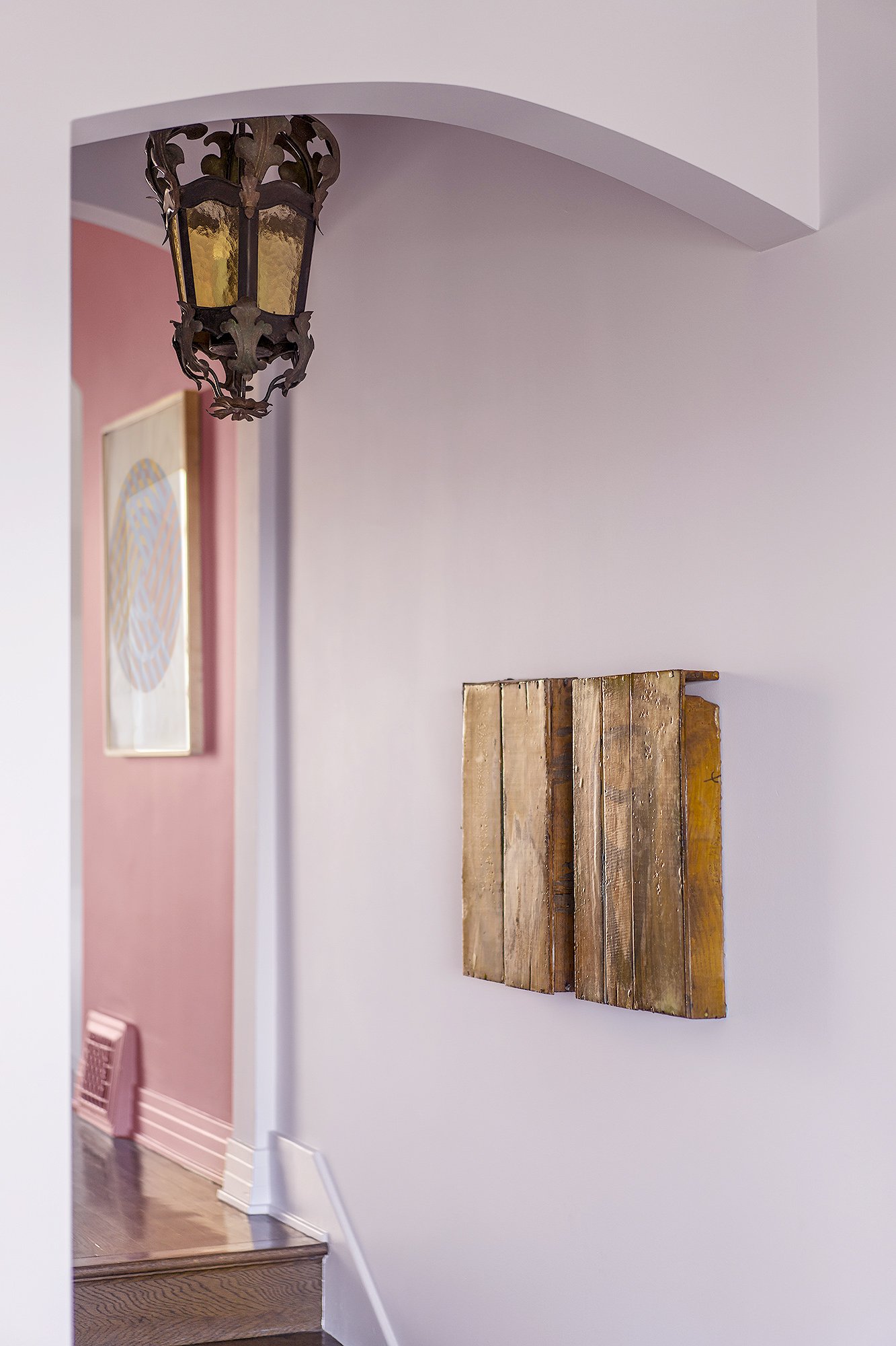
Image © Manolo Langis
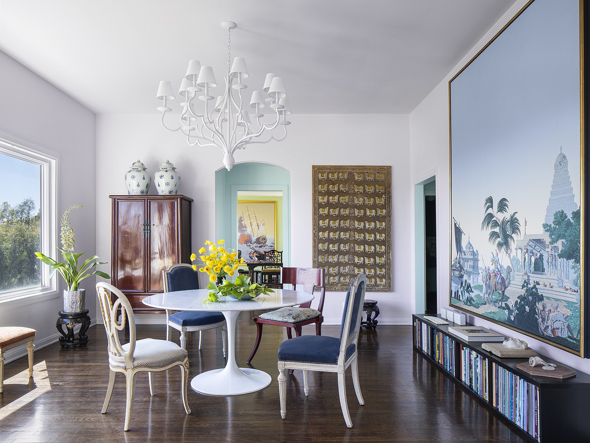
Image © Manolo Langis

Image © Manolo Langis

Image © Manolo Langis
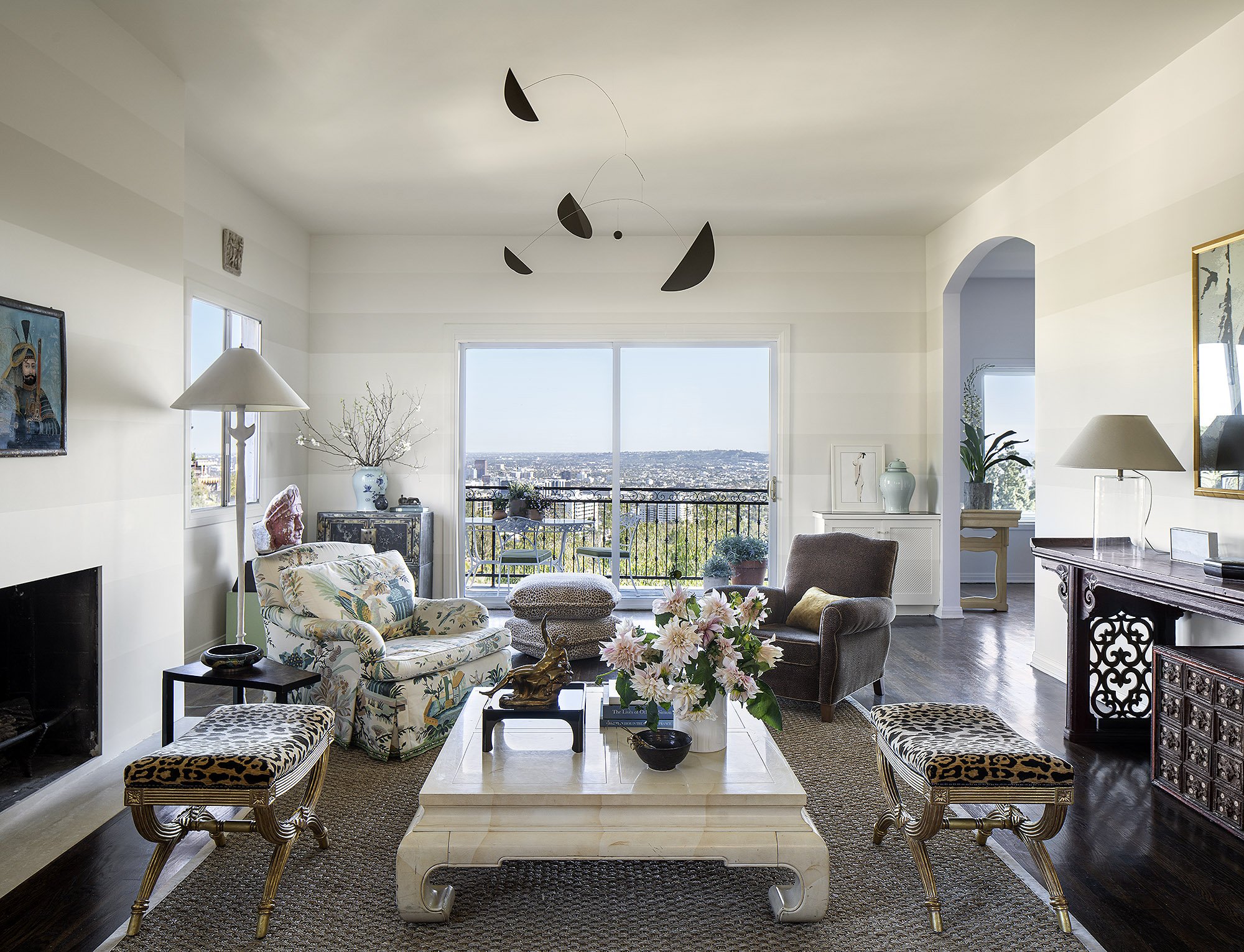
Image © Manolo Langis
The journey begins in the foyer. Where Anthony & Apollo’s two temperaments meet.
Fawn, frames an antique mirror. Blanche Dubois Sister, brings the glow. Warm. Soft. Vibrant.
A ceiling of Whistler Blackcomb, lifts the space— visually expanding what walls contain.
The Grand Salon tells their story. Tri-colour stripes. Anthony’s quiet elegance. 1930s French Deco.
Contrast creates energy. Apollo’s rhythm enters the room. Two temperaments. One balanced space.
A blush of dusty pink travels from foyer to Salon— a subtle stream of energy.
Arched openings become colour pauses— palate cleansers between worlds.
The dining room recedes in Delicious, — icy lavender, calm and composed. The ceiling in Divina, opens upward. Light. Possibility. Ease. A picture window blurs inside and out— dining outdoors, from within.
An arch in Atmosphere, — a pale aqua transition from Salon to office. A soft pause.
Another colour cleanse.
Beyond the arch, Apollo’s office. Defined by Teenager,— a fresh, bold green that supports focus, energy, and flow.. Work space meets productivity.
Moving through this section of the home feels like stepping through a Ladurée pâtisserie— sweet, calm, and quietly transportive.
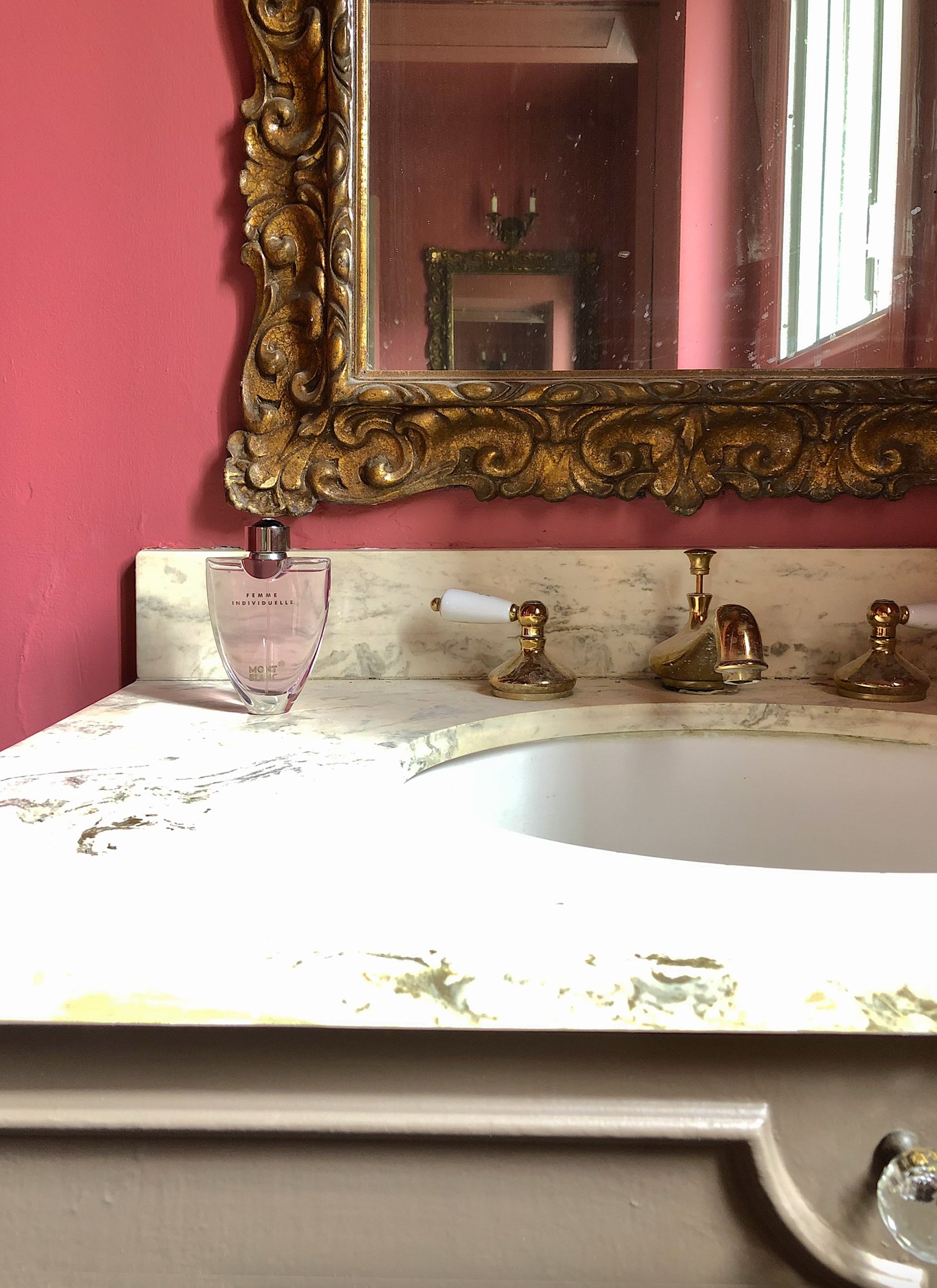
Image by Gillian Rose

Image © Manolo Langis
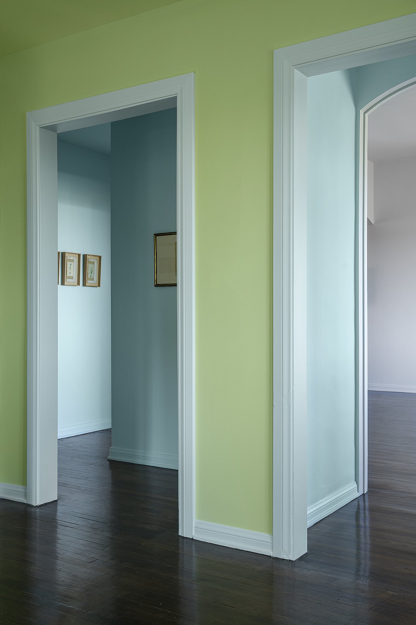
Image © Manolo Langis
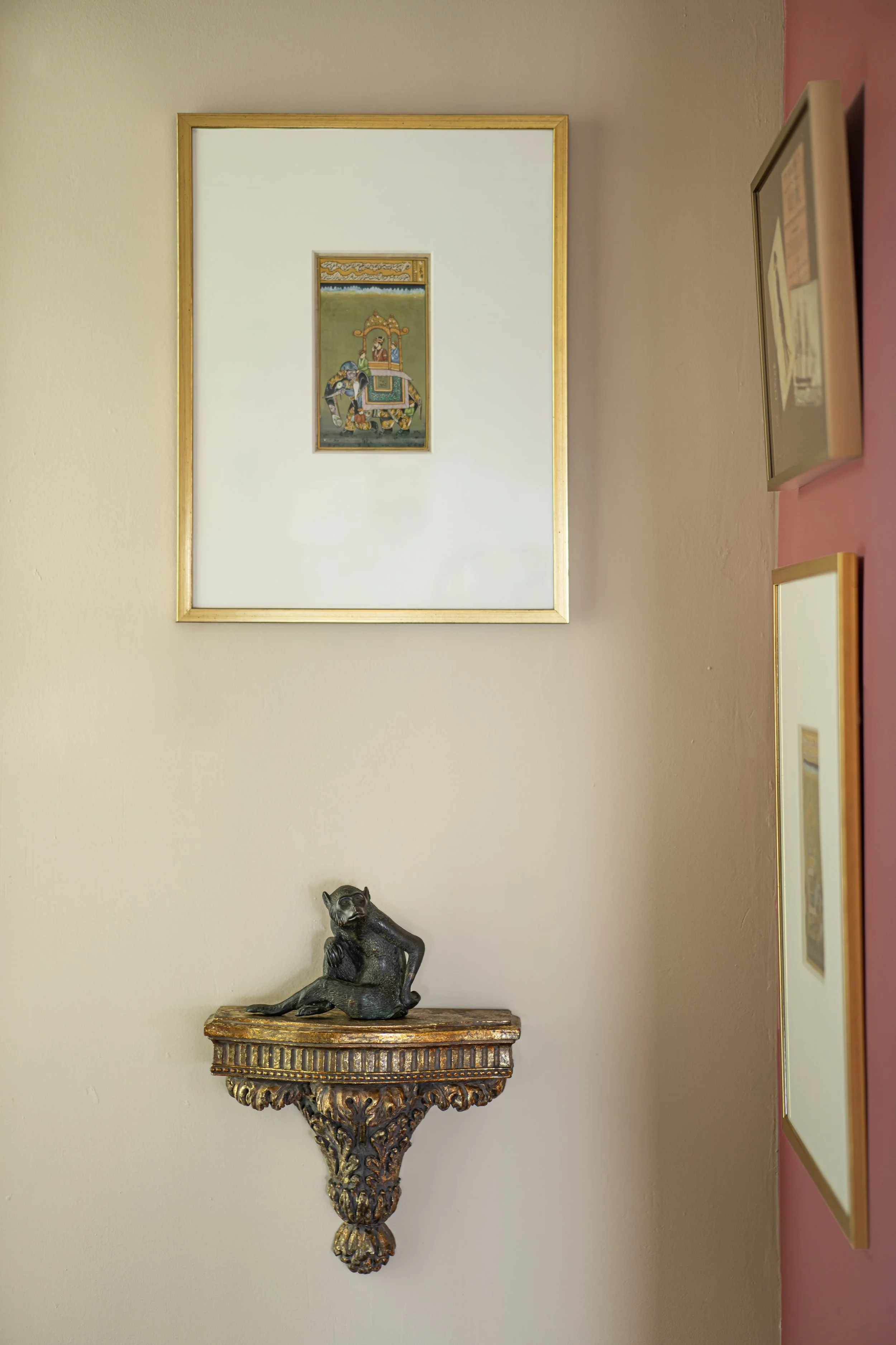
Image © Manolo Langis
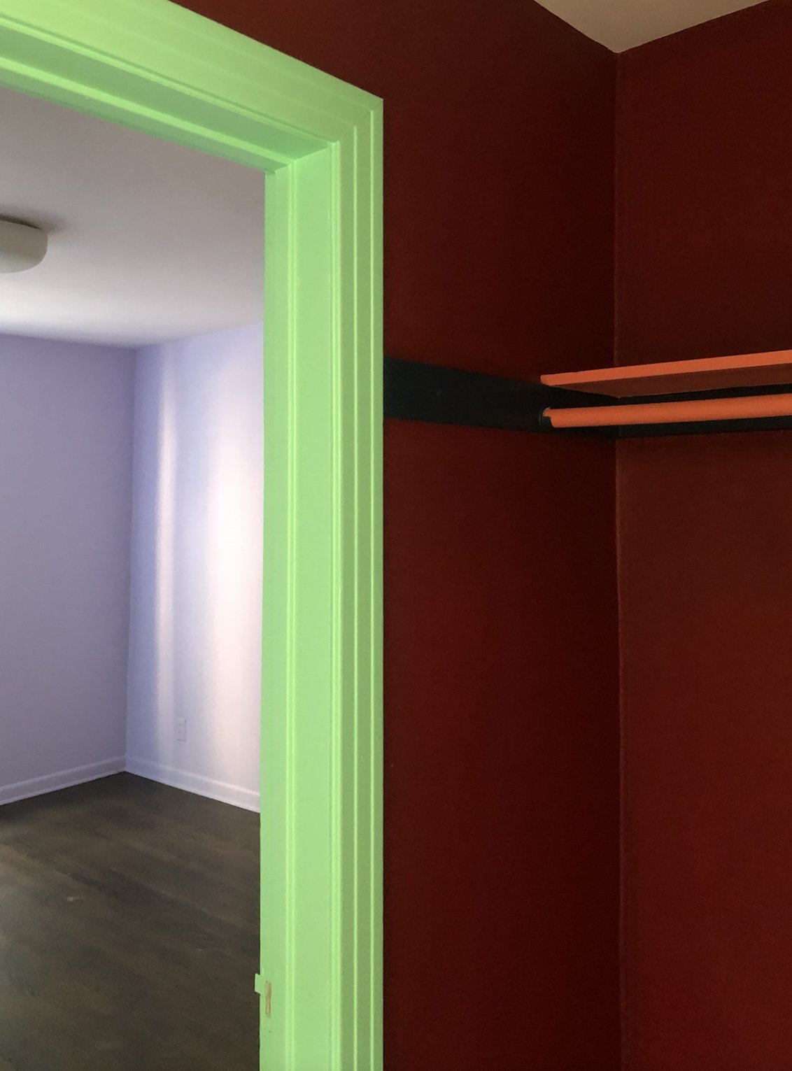
Image by Gillian Rose
The powder room and bar are we we embraced a few bold colours. Spaces designed around purpose.
The powder room is wrapped in Silk Taffeta,— a sensual vermilion and playful stage for a menagerie of monkeys.
The bar channels Bemelmans Bar at The Carlyle — New York glamour at home. Encased in Lahey Sky,
a saturated blue with presence. Balanced by crispness of Monet, a cool green that lets nature breathe beyond the walls.
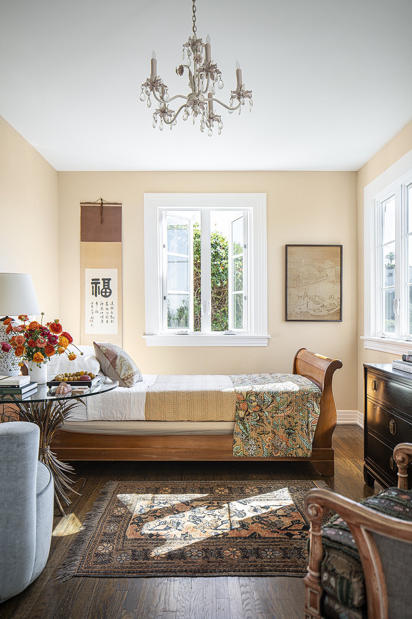
Image © Manolo Langis
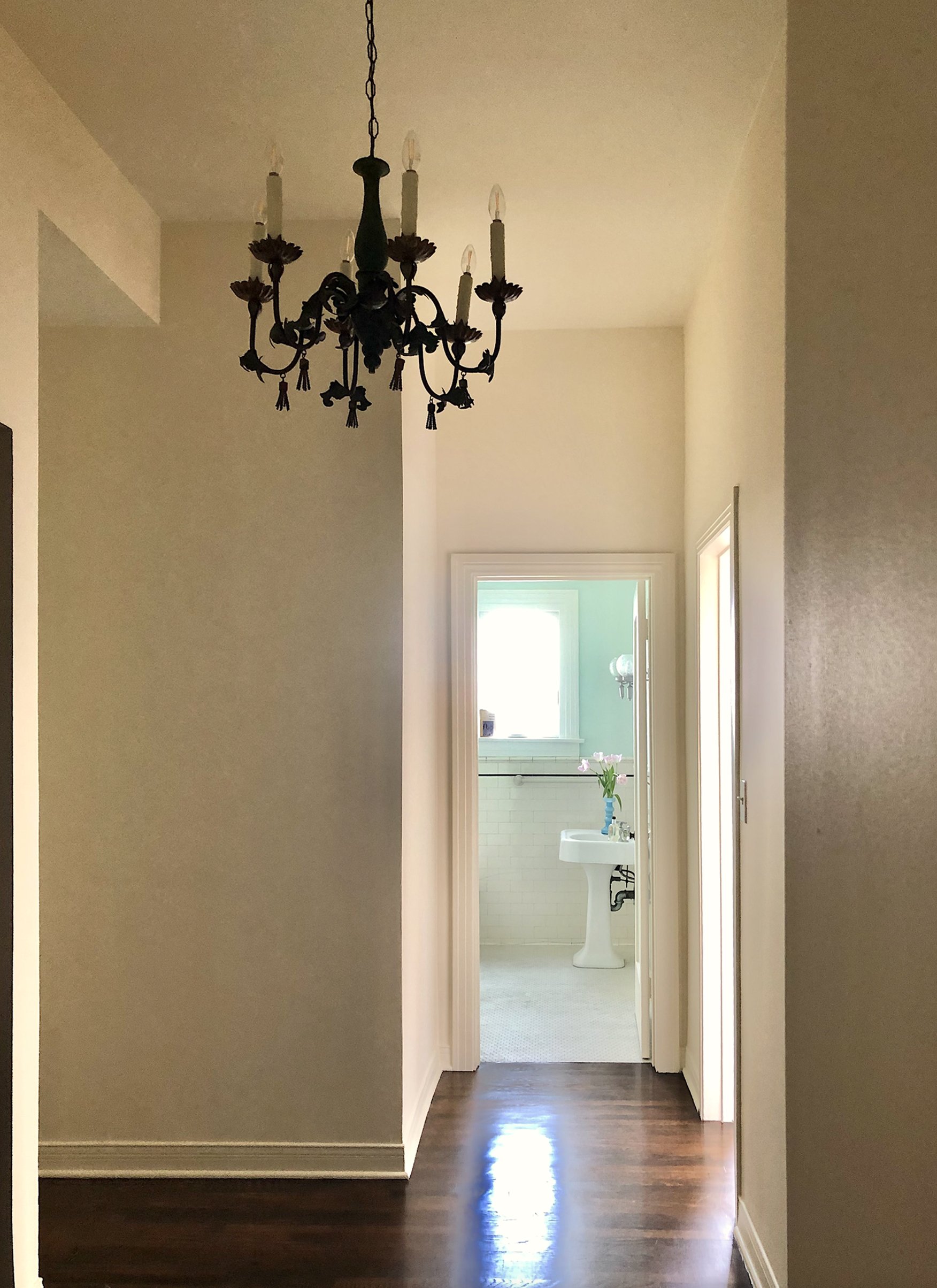
Image by Gillian Rose
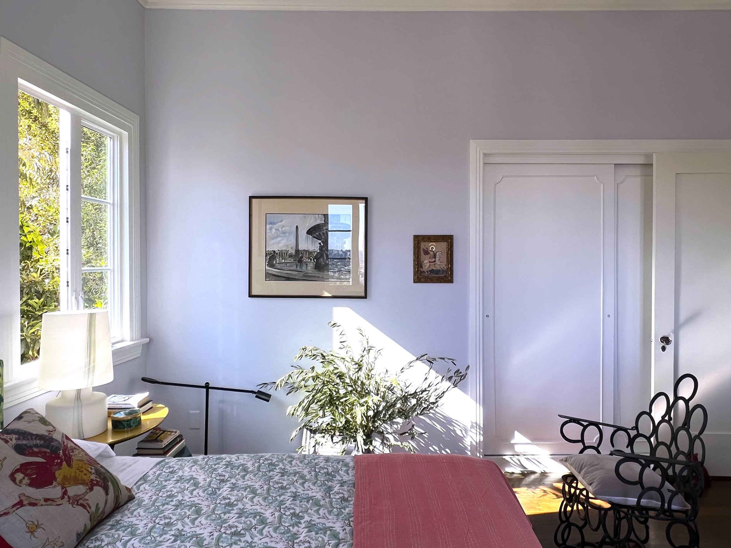
Image © Manolo Langis

Image by Gillian Rose

Image by Gillian Rose
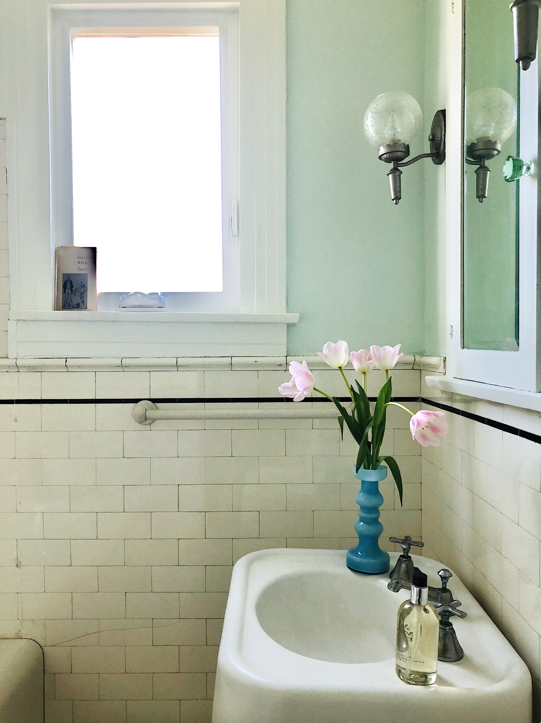
Image by Gillian Rose
Because of the lower grade of the private sleeping floors, they have an even greater foliage refection. We went with a less saturated color palette.
Guest bedroom #1, took on the personality of Medieval Florence, being painted in a custom color Sienna, a gesture towards Mamie’s red petticoat, the closet became cloaked in custom color, Pink Revolution.
While each of the 5 bedrooms has its own distinct personality and colour story, we will focus on the Primary Bedroom
The Primary Bedroom was designed to be as serene as it is beautiful, there is so much more going on in here, than simply, beauty.
The color palette reflects Anthony’s need for serenity and less stimulation. Evoking the feeling of being within a cocoon in the ultimate treehouse.
The paint colours shown here on the walls: I Do. The trim and ceiling colour had to be a custom creamy white, to counterbalance the reflections, flooding in from the vibrant greens of the surrounding foliage.

A palette of 40 colours. Created purely for our fabled couple.
Each shade intentionally woven into the experience of the home.
This palette reflects how they live, how they connect, how they move through life together.
A colour story built on love, rhythm, and intention.
The maquette reveals the sequence and order — in which colour unfolds as you move throughout the home.
A home experienced in colour, not just seen. Few things in the world are truly about us.
Our individual response to colour is one of them.